Summary: A professional landing page is a destination page designed with a single conversion objective. To create it correctly, you need a clear value proposition, an optimised form, social proof, and a visible call to action. Well-structured pages reduce user friction and measurably increase conversion rates.
What is a Professional Landing Page and Why It Matters
A professional landing page is a destination webpage designed with a single objective: to get the visitor to perform a specific action, whether it's filling out a form, requesting a quote, downloading a resource, or completing a purchase. Unlike a generic homepage, a landing page eliminates secondary navigation and focuses all the user's attention on a single decision. According to HubSpot data published in 2023, companies that use ten or more landing pages generate 55% more conversions than those using five or fewer. This data illustrates why landing page creation is not an optional step in a lead generation strategy, but a measurable and direct growth lever. For any business investing in paid traffic or email campaigns, sending users to a specific landing page instead of the homepage is the difference between a controlled acquisition cost and one that bleeds budget with no return.
The term "professional" in this context isn't decorative.
A professional landing page is distinguished from a basic one by three objective criteria: visual consistency with the originating campaign (what's called message match), absence of distractions that compete with the main call to action, and measured and optimised loading speed.
A page that takes more than three seconds to load loses, on average, between 40% and 53% of its visitors before they even see the content, according to Google PageSpeed Insights figures collected in their official 2022 reports.
For businesses operating in Spain, this takes on particular relevance because competition on channels like Google Ads or Meta Ads has driven up the cost per click in practically all sectors since 2021. If traffic costs more, the efficiency of the page receiving it becomes critical. Creating a high-converting landing page ceases to be a nice-to-have and becomes an operational necessity.
Additionally, from an SEO perspective, well-structured landing pages can rank for long-tail commercial searches, which adds high-intent organic traffic without incremental cost per click.
What Are the Essential Elements of a Converting Landing Page?
Any converting landing page shares a set of structural elements that conversion optimisation research has consistently validated. The first is the main headline (page H1), which should communicate the specific benefit in fewer than ten words and match the message of the ad or email that brought the user there. The second is the secondary value proposition, usually a two-line sub-headline that expands on the benefit and adds a differentiator. Together, the headline and sub-headline have between three and five seconds to convince the visitor that it's worth reading on, according to the Nielsen Norman Group's attention model. Without these two elements well-resolved, the rest of the page works in vain.
Headline and Value Proposition
The headline should answer an unasked user question: "Is this for me and is it worth my time?".
To achieve this, it needs to talk about the result the user gets, not the product or service features. "Get a quote in 24 hours" converts better than "Online quote service" because the former puts the user at the centre.
The secondary value proposition should add the differentiator: why you and not the competition. This could be speed, guarantee, price, specialisation, or proof of results. The important thing is that it's specific and verifiable, not a generic claim.
Optimised Lead Capture Form
The lead capture form is the highest friction point on any landing page. The general rule is to ask only for the data strictly necessary for the objective. If the goal is to qualify a B2B lead, name, email, and company might be sufficient. Each additional field reduces the conversion rate. Experiments published by Unbounce have shown conversion reductions of up to 11% for each extra field added to the form.
The text on the submit button also matters. "Submit" is the worst possible text because it says nothing about what happens next. "Receive my free quote", "Download the guide", or "Speak to an advisor" are examples of button calls to action that reinforce the benefit and reduce user uncertainty.
Social Proof and Guarantees
Social proof is the set of signals that tell the visitor that others have trusted you before them. It includes testimonials with real names and companies, client or media logos, numerical ratings, and use cases.
The most effective position for social proof is immediately below the form or the main call to action, not at the bottom of the page where few visitors reach.
Guarantees, such as a return policy, no-commitment options, or a promise of a response within X hours, act as perceived risk eliminators. A visitor arriving at your landing page from an ad doesn't know you.
Reducing their perceived risk is as important as reinforcing your benefit.

What is the Recommended Structure for Creating a Professional Landing Page?
The structure of a professional landing page follows a visual and narrative hierarchy that guides the visitor from the first impression to conversion. This hierarchy isn't arbitrary: it responds to the real behaviour of users who scan pages in an F or Z pattern before deciding whether to stay. According to Nielsen Norman Group's 2020 eye-tracking study, 79% of users scan web content rather than reading it word-for-word. Designing a landing page without considering this behaviour is building for a reader who doesn't exist. The structure we present below starts from this reality and organises elements in the order the user needs them to make a decision.
Block 1: Hero section (above the fold)
The hero is what the user sees without scrolling. It should contain:
- The main headline with the key benefit.
- The sub-headline with the differentiator.
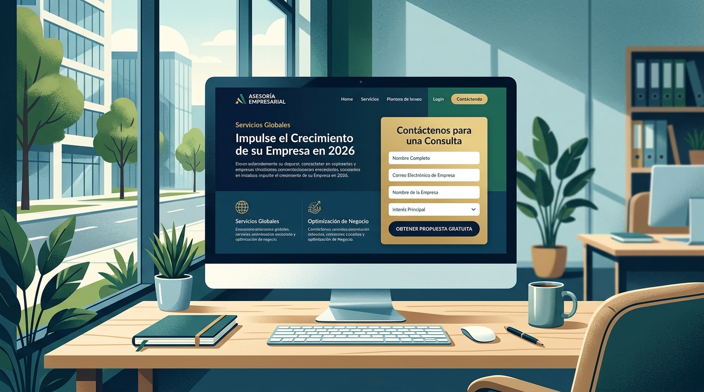
- A visible call to action (button or short form).
- An image or visual element that reinforces the message (not distracts from it).
The hero should not contain a full navigation menu. If the landing page belongs to a paid campaign, the standard practice is to remove or minimise the navigation bar to prevent the user from leaving the page before converting.
Block 2: Benefits Section
After the hero, visitors who haven't converted immediately need more context. The benefits section breaks down what the user gains into three or four concrete points.
Each point should be a tangible result, not a technical feature. "Save 3 hours a week on management" is a benefit. "Intuitive administration panel" is a feature. Benefits convert more.
Block 3: Social Proof
Here go the testimonials, logos, or ratings. Social proof works best when it's specific: a testimonial that mentions a concrete result ("I went from 5 to 23 leads a month") carries more weight than a generic one ("Very good service").
Block 4: Closing Call to Action
Before the footer, repeat the main call to action. Users who have read to the end already have enough information to decide. Giving them a second conversion point without forcing them to scroll back up increases conversions on long pages.
Which Tools for Creating Professional Landing Pages Stand Out in 2026?
There's a consolidated ecosystem of tools for creating landing pages that covers everything from drag-and-drop options designed for teams without developers to solutions that integrate with CRMs and automation platforms. Choosing the right tool depends on three variables: the volume of pages you need to create, the technical level of your team, and the degree of integration with your current marketing stack. There isn't one universally better solution, but there are clear criteria for choosing the one that fits your case.
No-Code Visual Builders
No-code visual building platforms allow you to create a lead generation landing page in hours without writing a single line of code. The most widely used internationally are Unbounce, Leadpages, and Instapage. These tools offer conversion-optimised templates, integrated A/B tests, and native connections with email marketing tools like Mailchimp, ActiveCampaign, or HubSpot.
The advantage of these platforms is the speed of implementation and the ability to iterate without relying on a developer. The disadvantage is that they involve a recurring monthly cost and that the generated pages live outside your main domain unless you configure your own subdomain.
CMS with Landing Page Modules
WordPress with plugins like Elementor or Divi allows you to create landing pages within your own domain, which benefits both SEO and user experience consistency.
This option requires more initial setup but gives greater control over the page's code, speed, and semantic structure.
For teams already managing their website on WordPress, adding a landing page with an existing page builder is the option with the least technical friction and lowest long-term cost.
All-in-one marketing platforms
HubSpot, ActiveCampaign, and similar platforms include modules for landing page creation within their marketing suites. The advantage is that conversion data is directly connected to the CRM and automation workflows, eliminating manual integrations and reducing the margin of error in lead tracking.
For B2B companies with complex sales processes, this integration offers real value: every lead captured on the landing page directly enters the sales workflow with a complete interaction history.

What are the common mistakes when creating landing pages?
Identifying common landing page mistakes is just as useful as knowing best practices, because many of these errors recur even in experienced teams. The most frequent is a lack of consistency between the ad message and the landing page message. If the ad promises "Download the B2B marketing guide for free" and the landing page talks about the company's services in general terms, the user perceives a discontinuity that generates distrust and abandonment. This phenomenon, known as message mismatch, is one of the main causes of high bounce rates on paid campaign landing pages.
Information overload and multiple objectives
A landing page with two or more competing calls to action divides user attention and reduces the conversion rate for each. If you want the user to request a quote AND subscribe to the newsletter AND follow your social media, you're designing for three distinct objectives. The result is that the user doesn't complete any of the three as frequently as they would if there were a single, clear path.
The practical rule is one landing page, one objective. If you have multiple objectives, create multiple landing pages, each optimised for a specific audience and stage of the conversion funnel.
Load speed and mobile optimisation
In 2026, over 60% of web traffic in Spain comes from mobile devices, according to data from the Digital 2024 report by We Are Social and Meltwater.
A landing page that isn't mobile-optimised or takes more than three seconds to load is discarding over half of its potential visitors before even showing them the message.
Speed optimisation includes compressing images, removing unnecessary scripts, using responsive hosting, and avoiding external fonts that slow down rendering.
Tools like Google PageSpeed Insights allow you to diagnose these issues for free, with concrete recommendations.
Lack of A/B testing
Creating an optimised landing page isn't a one-off event; it's an iterative process. Publishing one version and not testing alternatives means leaving performance on the table. A basic A/B test between two versions of a headline or call-to-action button can improve the conversion rate by 10% to 30%, depending on traffic variability and the quality of the hypothesis being tested.
The teams that convert the most aren't those who get it right the first time, but those who test more hypotheses in the shortest possible time with real traffic.

How to Measure Your Landing Page Performance
Measuring the performance of a conversion landing page requires first defining the primary conversion event and ensuring it's correctly tagged before driving traffic. Without precise measurement, any optimisation decision is guesswork. The key indicators you should monitor are conversion rate, bounce rate, time on page, and the traffic source generating each conversion. These four data points together allow you to diagnose whether the problem lies with the incoming traffic (incorrect audience), the message (high bounce with low time), or the form (high time but low conversion).
Conversion rate and industry benchmarks
The average conversion rate for a landing page varies significantly depending on the industry, objective, and traffic source. Wordstream reported in 2023 that the average conversion rate for landing pages in Google Ads is 2.35%, but the top quartile exceeds 5.31%.
This means there's real room for improvement for most pages, and that 5% isn't a limit, but a top-quartile benchmark.
For landing pages for lead generation in B2B sectors in Spain, rates between 3% and 8% are achievable with a solid structure, qualified traffic, and a differentiated value proposition.
Analytics and tracking tools
Google Analytics 4 is the starting point for measuring the performance of any page. Configuring conversion events in GA4 allows you to track form submissions, call-to-action clicks, and thank-you pages as conversion destinations.
Additionally, heatmap tools like Hotjar or Microsoft Clarity (free) allow you to see exactly where users click, how far they scroll, and at what point they abandon a form.
The combination of quantitative data (GA4) with qualitative data (heatmaps and session recordings) forms the basis of a continuous optimisation process that improves conversion rates with each iteration.

Frequently Asked Questions
How long does it take to create a professional landing page?
With a no-code visual builder like Unbounce or Elementor, a well-structured landing page can be ready in one or two working days if you have the content (text and images) prepared. If you're starting from scratch with copy and images, allow three to five days for a quality result.
Do I need a developer to create a landing page?
Not necessarily. Current visual building tools allow you to create pages without code.
A developer adds value when you need complex integrations, advanced customisation, or when the landing page needs to be integrated into an existing web architecture with specific technical requirements.
How many fields should a landing page form have?
The optimal number depends on the objective and the stage of the conversion funnel. For lead capture at the top of the conversion funnel (cold traffic), two or three fields are sufficient.
For more qualified leads at the bottom of the conversion funnel, you can ask for more data because the user already has higher intent and tolerance for friction.
What's the difference between a landing page and a homepage?
A homepage is designed for multiple audiences and simultaneous objectives. A landing page has a single objective, a single audience, and a single call to action.
That's why it converts better for specific campaigns: it eliminates distractions that make sense on the homepage but only cause attention leakage in a campaign.
Is it better to host the landing page on my domain or an external subdomain?
From an SEO perspective, hosting on your own domain or subdomain transfers more authority and facilitates unified tracking in GA4. From an implementation speed perspective, external platforms are quicker to deploy.
For purely paid campaigns with no SEO objective, the difference is smaller. For landing pages you also want to rank organically, your own domain is the correct choice.
How often should I update or review my landing page?
Every time you launch an A/B test with statistically significant results, update the winning version.
Additionally, review the page every three to six months to ensure that social proof (testimonials, logos) is still current and that the value proposition remains competitive with market offerings.
